Express Scripts Pharmacy

Express Scripts, a major healthcare player since 1986 and the first pharmacy to pioneer prescription home delivery service, had a problem: despite deep market saturation, the company had an inconsistent, outdated brand identity.

GOAL: Create a new verbal and visual brand representative of the dedication and “you first” approach at the core of Express Scripts.

BRANDING: As part of R/GA’s Brand Design & Consulting group, Rachel led day-to-day creative, partnered closely with cross-departmental leads, developed strategy and conducted qualitative research, managed teams, and worked hand-in-hand with the client to anticipate and respond to scope adjustments, provide brand education, and organically strengthen our relationship. In the end, she was proud to shape a happy, long-lasting client partnership as well as deliver an approachable, modern brand (and comprehensive playbook) that reflected Express Scripts’ heart and humanity.

DELIVERABLES

  • Visual and Verbal Brand Education Modules

  • Qualitative Consumer Research

  • Refined Brand Strategy

  • Robust Brand Playbook, Complete with Brand Character, Manifesto, Voice, Messaging Themes, Custom Tools, and More

  • Repeat Client Work (Video): Treatments and Scripts/Storyboards

An animated gif with various colors and patterns that says "Meet Express Scripts Pharmacy. Youre medication delivered for an average of 28% less shipped right to you." It resolves to the Express Scripts Pharmacy logo.

BRAND EXECUTION

Logo/wordmark animation showcasing “the X factor”—that extra spark Express Scripts gives its customers—via the X mark.

Logo/wordmark animation showcasing “the X factor”—that extra spark Express Scripts gives its customers—via the X mark.

A white "x" in a blue rectangle shows the "x" means guidance. An orange rectangle has a thin black "x" around a pill held by a hand, creating emphasis. In a yellow rectangle, a black "x" sits between "empathy" and "expertise," showing connection.

Playbook guidelines for usage of the X mark.
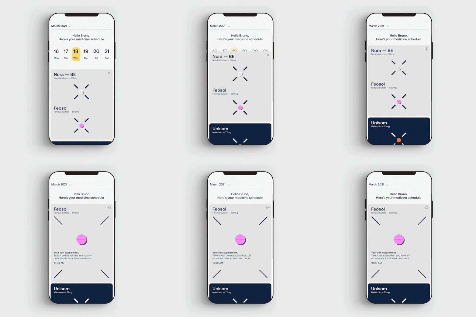
An animated demo of the "future state" of the app. The copy above a calendar says, "Hello Bruno, Here's your medicine schedule." A date on the calendar expands, showing medicines for that day. It expands again on Feosol to give more information.

Visualization of a future state of the Express Scripts app fully incorporating the new brand and experiential design for the X mark.

A rotating image in a sideways rectangle with changing black text on different colors. It says "Explore," "Expert," "Express," "Expand," "Excel," "Exceed," "Extra," "Exact," and "Excite." The "x" is replaced with the brand "x" mark.
6 ads with different colors/patterns on left, black text on white on right with logo. Text includes: "Here to deliver pharmacy, right to you." "The pharmacy built around you." "We sweat the small stuff so you don't have to." And 3 others.
Left: Logo in white on blue. Middle: The white "x" mark around a woman with dark hair in a yellow jumper on orange background. Right: Black text on white says, "The pharmacy that's with you, behind you, and built with you in mind. Since 1986."
Billboard on a building. Over a green background, the word "extra" in dark blue. In front, a woman in a lab coat with a warm expression. Copy in the upper right corner reads, "Our pharmacists will always go the extra mile for you."
Left: "Three months of medication, delivered" above drawing of pill bottle. Middle: Photo of woman's hand holding a pill bottle with a graphic ("Days 7"). Right: "We're your kind of pharmacy. Three decades, tried and true, time tested. Est. 1986"
Examples of out-of-home ads that look pasted up on a wall. Text includes phrases like, "12 years in practice. 13,000 patients counseled. One devoted pharmacist." and "A pharmacy that delivers is good. A pharmacy that overdelivers is even better."
An example of swag. A tote bag with the Express Scripts Pharmacy logo, the brand colors, and several custom illustrations. The dark blue straps repeat the Express Scripts Pharmacy logo.
Next
Next

TravelBank